A lot of statistical tests assume normal distribution of raw data or residuals from predicted model outcomes. One way to check for normality is visual, using histograms or Q-Q plots. Another way is statistical.
Of the statistical tests of normality, the Shapiro-Wilk test is the most powerful. See Razali and Wah for further discussion about power.
I’m more interested in the false-positive rate of the Shapiro-Wilk test than it’s power (the true-positive rate), as if the test falsely identifies data from a non-normal population as normal, it would undermine further analyses, and the conclusions of a study. On the other hand, if the test finds data from a normal population to be non-normal, an alternative analysis would be chosen that is more robust to non-normal distributions, which would probably not damage the study in any way if the test was incorrect.
But how often might data from a non-normal population be identified as normal? To provide a tentative answer to this question, I simulated continuous, random and univariate data of various sample sizes to assess the false normality rate of the Shapiro-Wilk test.
Using the code appended to this post, this plot was produced:
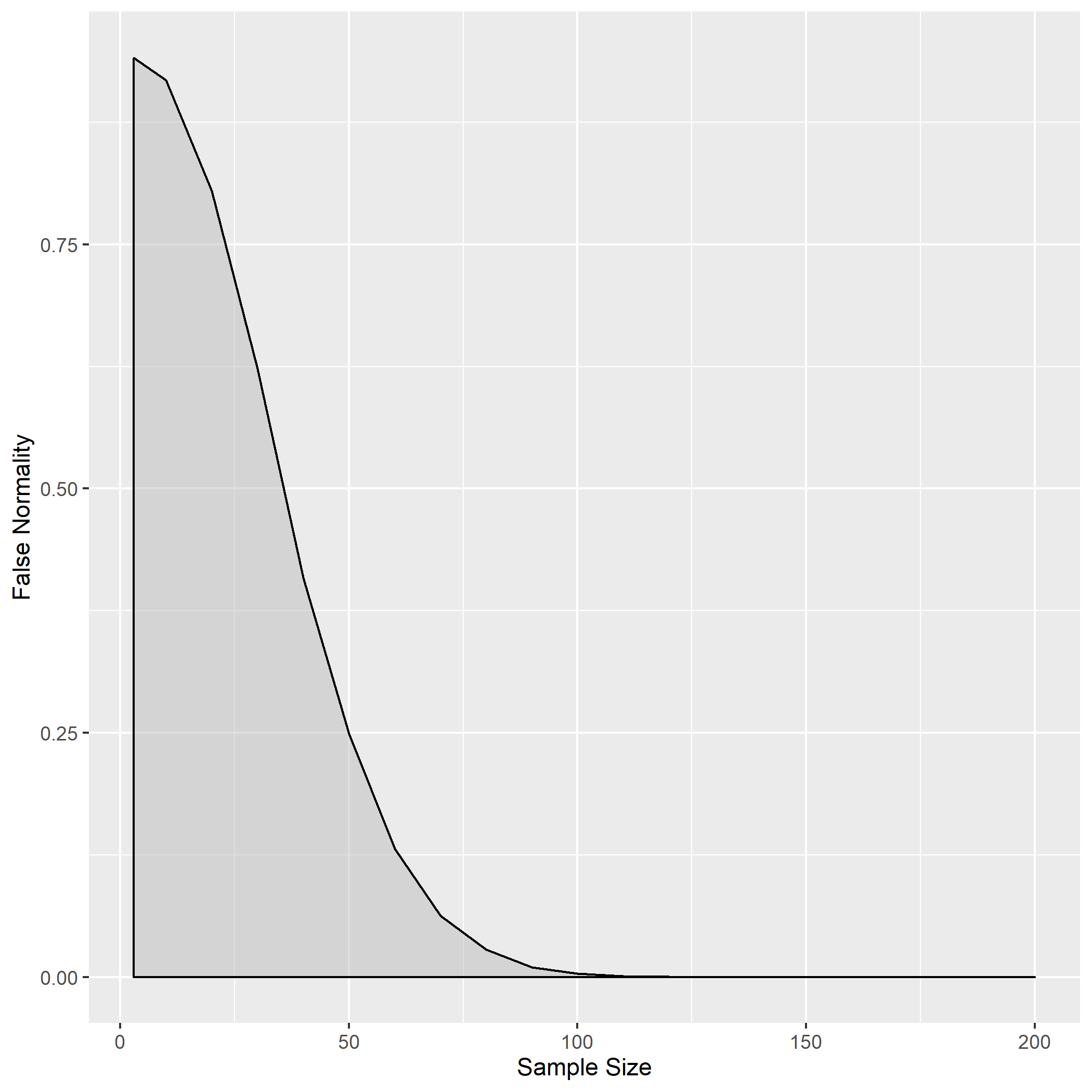
From around a sample size of 100, the Shapiro-Wilk test is pretty much 100% accurate, never identifying a normal distribution in completely random data across 10,000 iterations. When the sample size is around 50, there is a 25% probability of random data being identified as normal. The lower the sample size, the higher the false normality rate. (Look at the variable falseNormData defined in the code below to see the exact values.)
From this exploration I think it is safe to say that, with small sample sizes, visual methods may be more appropriate for assessing normality, and the population distribution is hard to estimate.
## Load required packages
library(tidyverse)
library(purrr)
library(ggplot2)

## Set Seed
set.seed(1)

## Making function to find "false normality rate" for one sample of uniform (random) data
falseNorm <- function(samp.size) {

n.tests <- 10000

tests <- vector(length = n.tests)

for (i in 1:n.tests) {
  u <- runif(samp.size, min = 0, max = 10)

  tests[i] <- shapiro.test(u)$p.value

}

falseNormality <- mean(tests>=0.05)

falseNormDataTemp <- tibble("false.normality" = falseNormality, "sample.size" = samp.size)

}


## Making vector to put into falseNormR() as "samp.size" argument
## MINUMUM SAMPLE SIZE IS 3
samp.sizes <- c(3, seq(10, 200, by = 10))

## Iterating falseNorm function and making dataframes
falseNormData <- purrr::map(samp.sizes, falseNorm) %>% bind_rows()

## Plotting
g <- ggplot(falseNormData, aes(x = sample.size, y = false.normality)) +
  geom_density(stat = "identity", alpha = 0.5, fill = "grey") +
  ylab("False Normality") +
  xlab("Sample Size")

## Uncomment next line to save the plot as an image
#ggsave("falsenormality.png", g)