In Daniel Laken’s MOOC, Improving Your Statistical Inferences, he discusses the distribution of p-values you can expect from a t-test when there is a true effect, and when there is not.
- If there is no true effect, all p-values are equally likely.
- If there is a true effect, the probability of seeing a significant p-value is equivalent to the power of the test.
I decided to try some simulations for myself, but instead of using t-tests, I used Spearman’s Rank correlations. I simulated 110,000 random samples of two normally distributed variables. The correlation between the variables was controlled such that there were 10,000 samples at r = 0, 10,000 at r = 0.1 and so on until r = 1. Each sample was tested using Spearman’s Rank and the p-values of each test were recorded.
The distribution of p-values for each effect size can be seen below. Each bar is 0.05 “wide”, meaning all values in the first bar are significant (when alpha = 0.05).
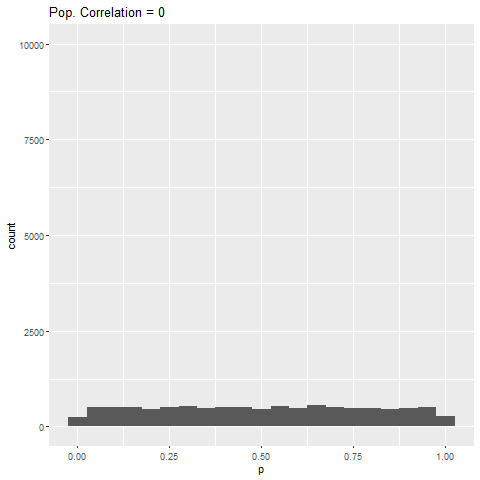
As expected, when there is no true effect (i.e., population correlation = 0), p-values are pretty much uniformly distributed. When there is an effect (population correlation > 0), the power of the test increases with the size of the effect.
What struck me was that from population correlation of 0.7 and above, the power of the test is 100%. I wouldn’t have expected this, given that the sample size in the simulations was quite small (fixed at 50). I didn’t experiment with the sample size, but you can mess around with my code and see what happens to the power.
## Loading packages
library(MASS)
library(tidyverse)
library(ggplot2)
library(gganimate)

## Making a funciton to record p-values from Spearman's Rank tests
## CHANGE "n.iter" IF YOU DON'T WANT TO RUN 110,000 SIMUALTIONS
cor.power.test <- function(r, size = 50, n.iter = 10000) {

  p.vals <- vector()
  coefs <- vector()

for (i in 1:n.iter) {
  data <- mvrnorm(n=size, mu=c(0, 0), Sigma=matrix(c(1, r, r, 1), nrow=2))
  x <- data[, 1]
  y <- data[, 2]
  test <- cor.test(x, y, method = "spearman")
  coefs[i] <- test$estimate
  p.vals[i] <- test$p.value
}

Data.r <- tibble("True.R" = r, "rho" = coefs, "p" = p.vals)

}

## Creating vector for r = 0 to r = 1.
rlist <- seq(0, 1, by = 0.1)


## Iterating function with different r values and making a dataframe of results
data.cor.power <- purrr::map(rlist, cor.power.test) %>% bind_rows()


## Plotting and animating
g <- ggplot(data.cor.power, aes(x = p)) +
  geom_histogram(binwidth = 0.05) +
  transition_states(True.R, transition_length = 1, state_length = 2) +
  ggtitle('Pop. Correlation = {closest_state}')

## Uncomment the next line to save animated plot "g" as a gif.
#anim_save("CorrelationP.gif", g)